Client Project | Real Estate Branding
Overview
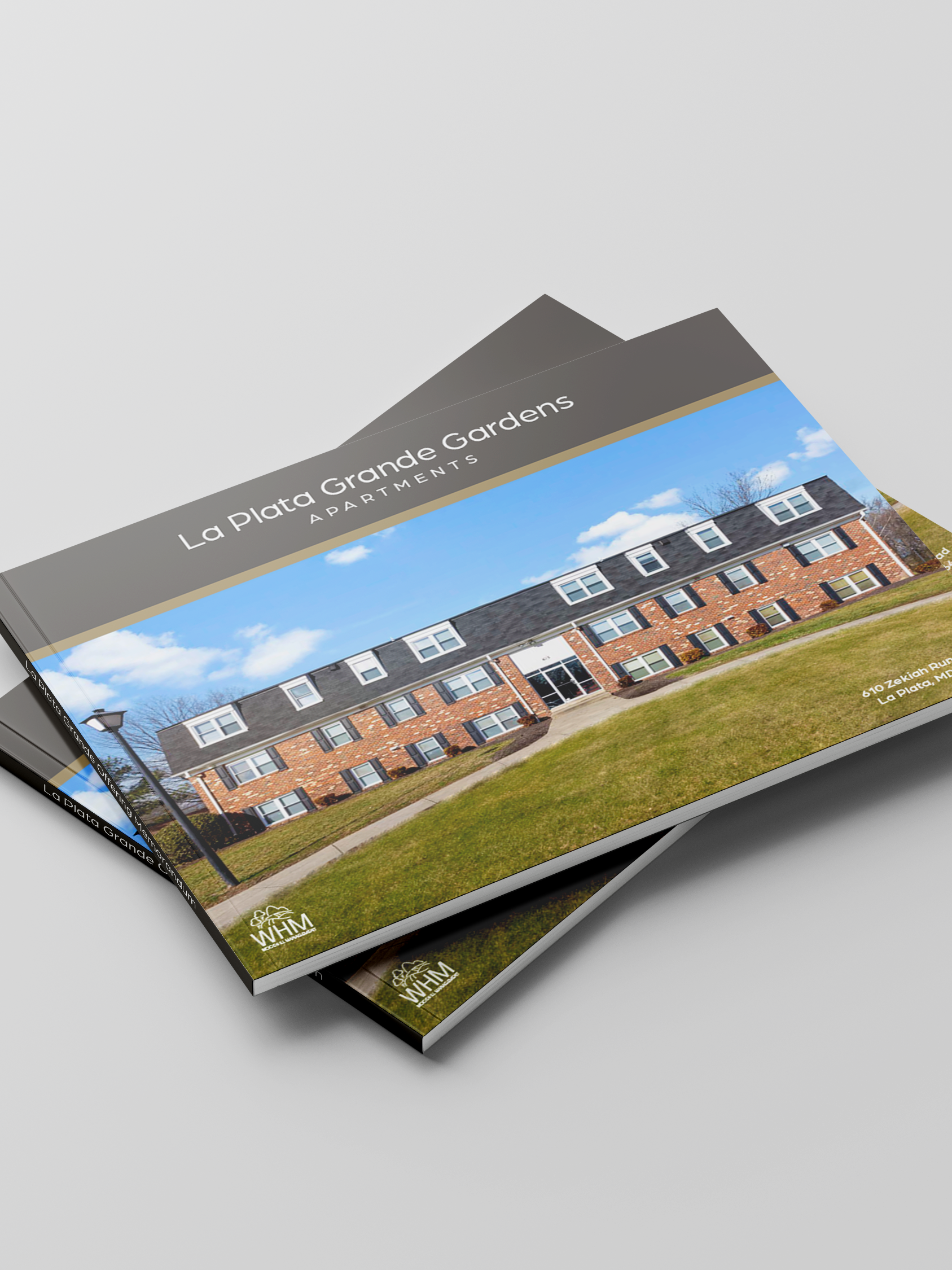
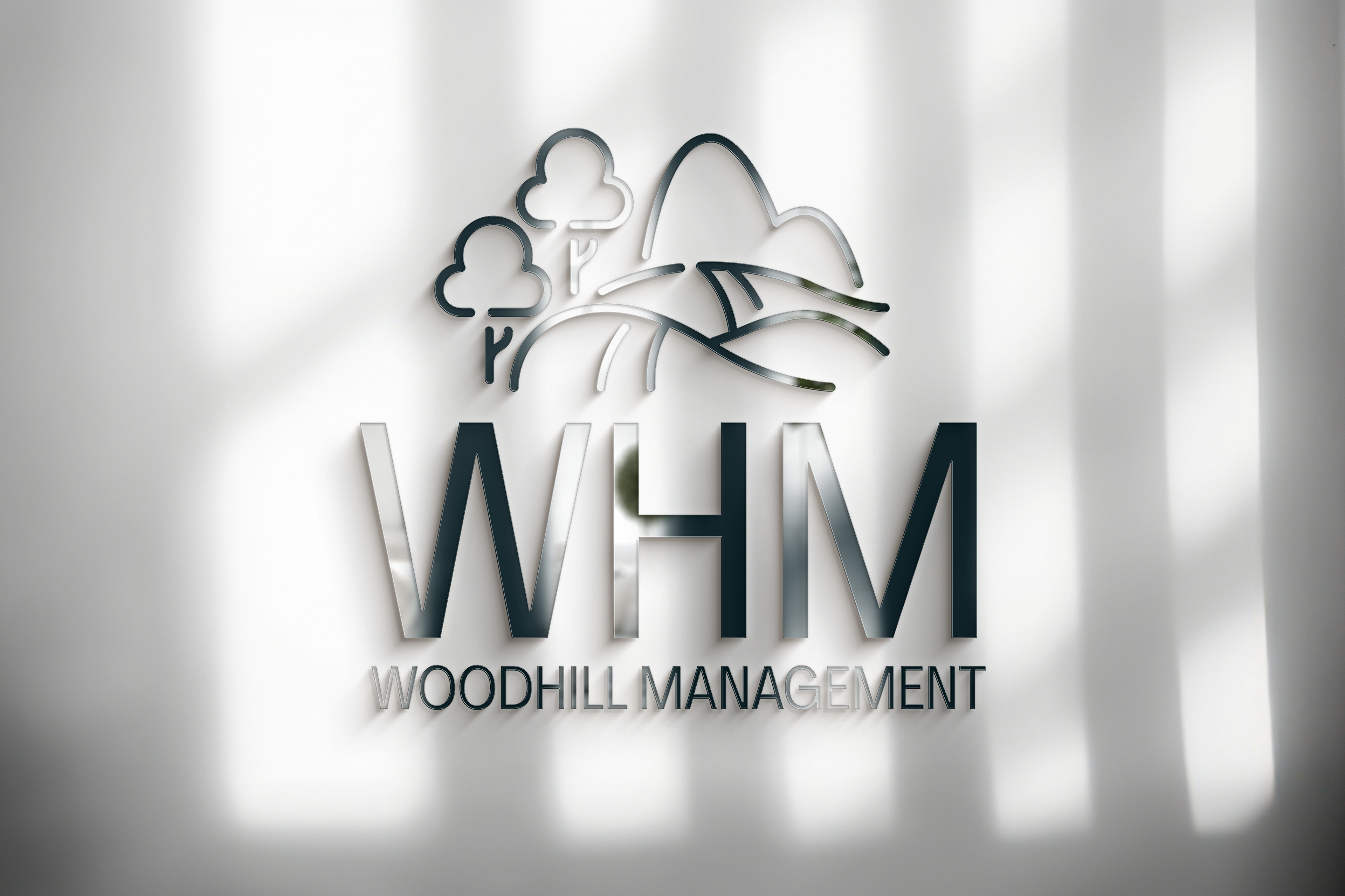
Woodhill Management is a real estate company specializing in multi-family residential properties. I was tasked with designing a logo that would visually communicate the brand’s values of growth, stability, and community.
Objective
The goal was to create a logo that balanced professionalism with warmth - appealing to both investors and tenants. The client wanted a mark that reflected their emphasis on sustainability and quality of life in the properties they manage.
Design Approach
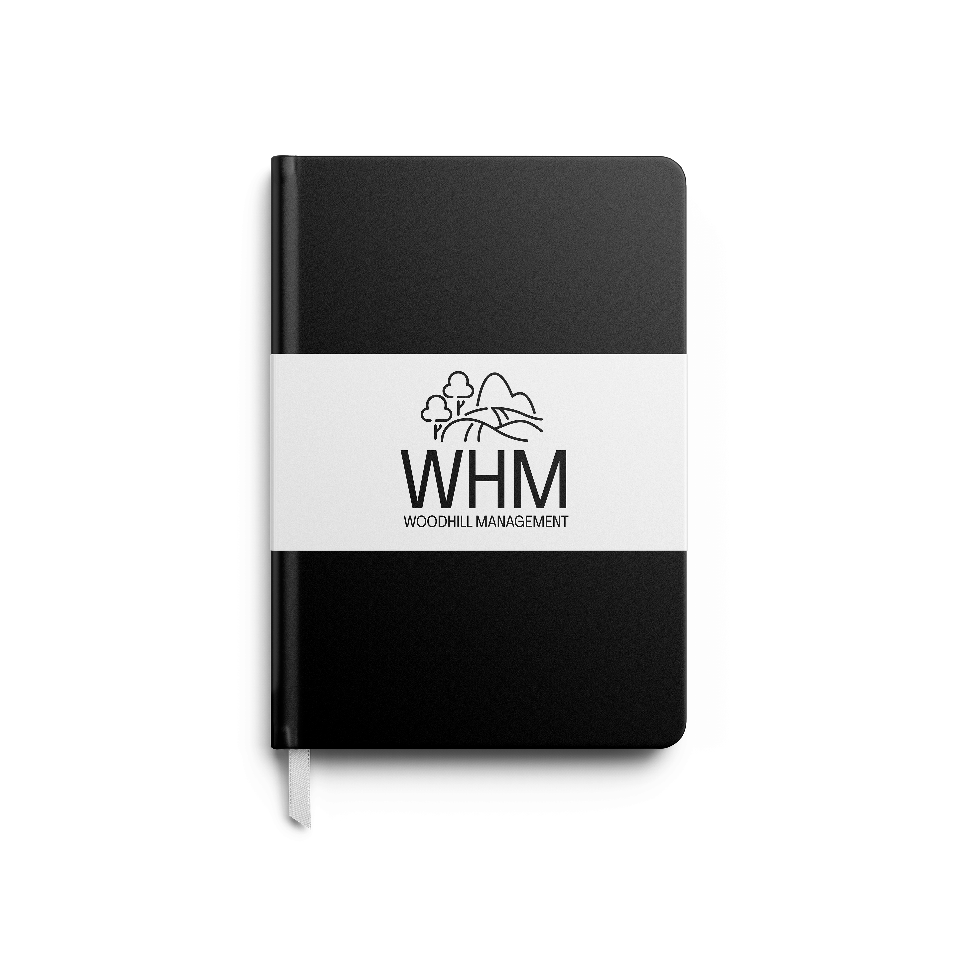
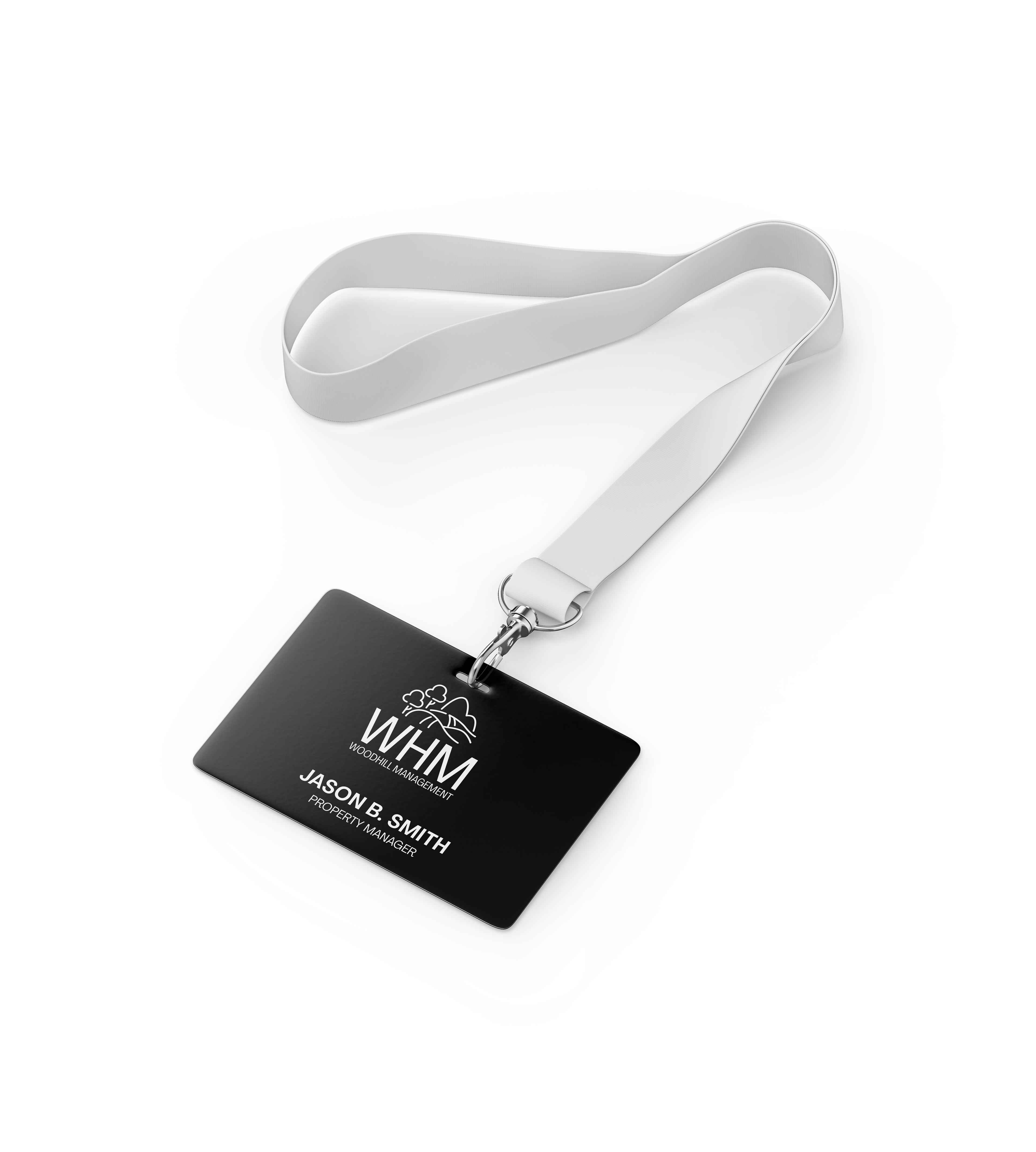
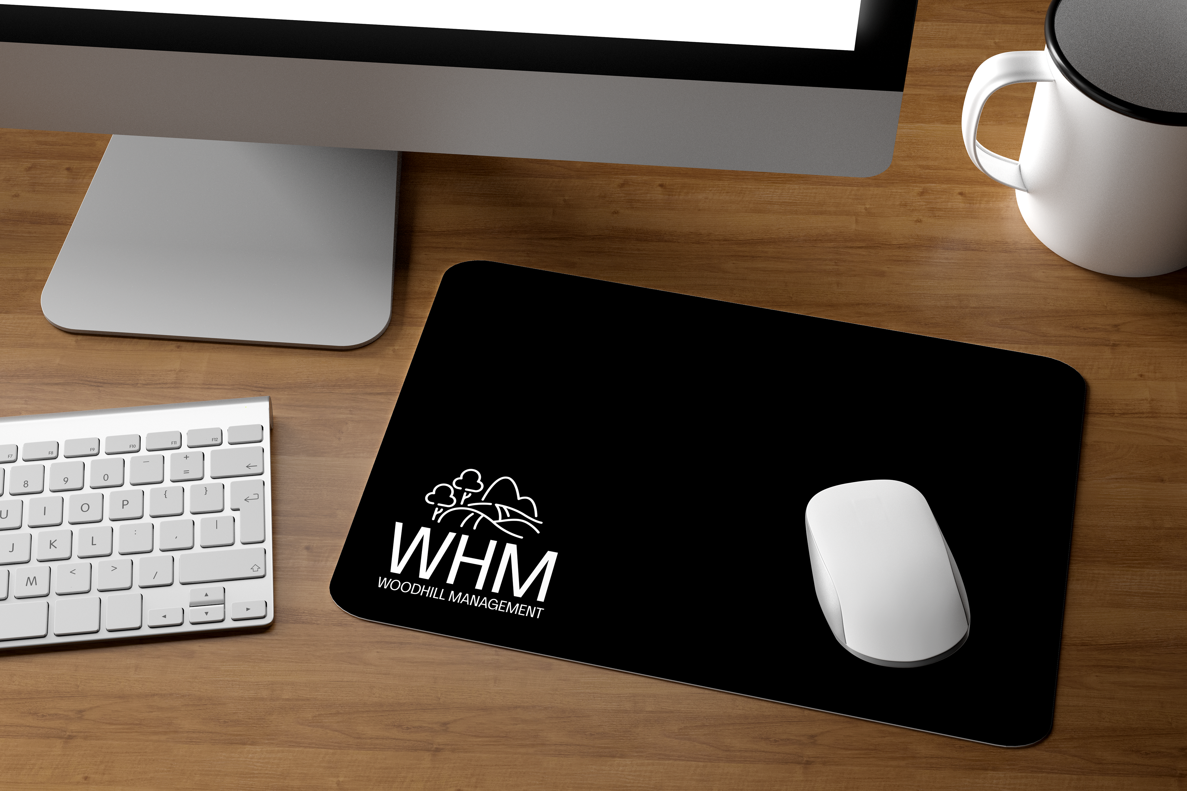
The final logo features stylized trees and rolling hills, representing harmony between urban development and nature. Rounded forms and organic lines evoke a sense of calm and livability, while the structured composition reinforces trust and professionalism. The design emphasizes nature-forward values without sacrificing clarity or versatility.
Outcome
The resulting brand mark captures the heart of Woodhill Management’s mission - fostering sustainable, welcoming communities. The logo is adaptable across print, digital, and signage applications, and has clean, meaningful visual identity.